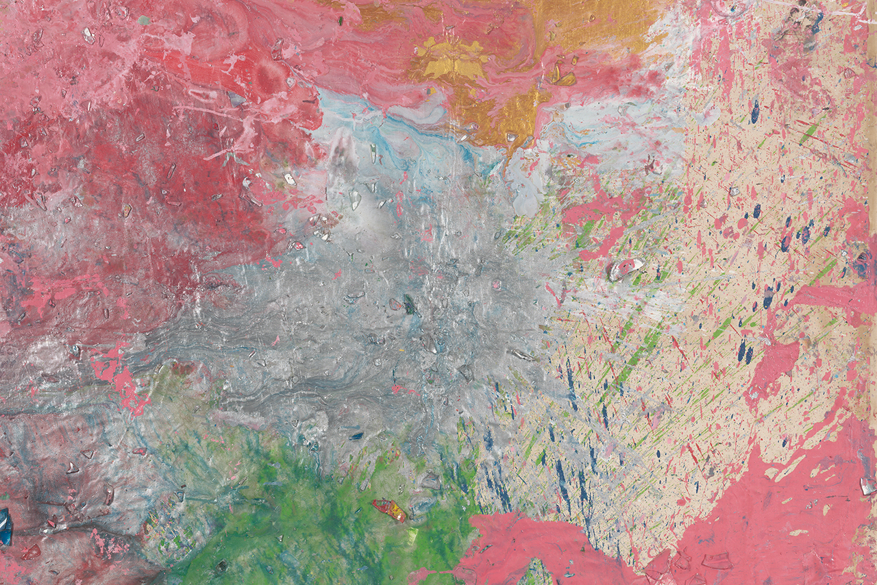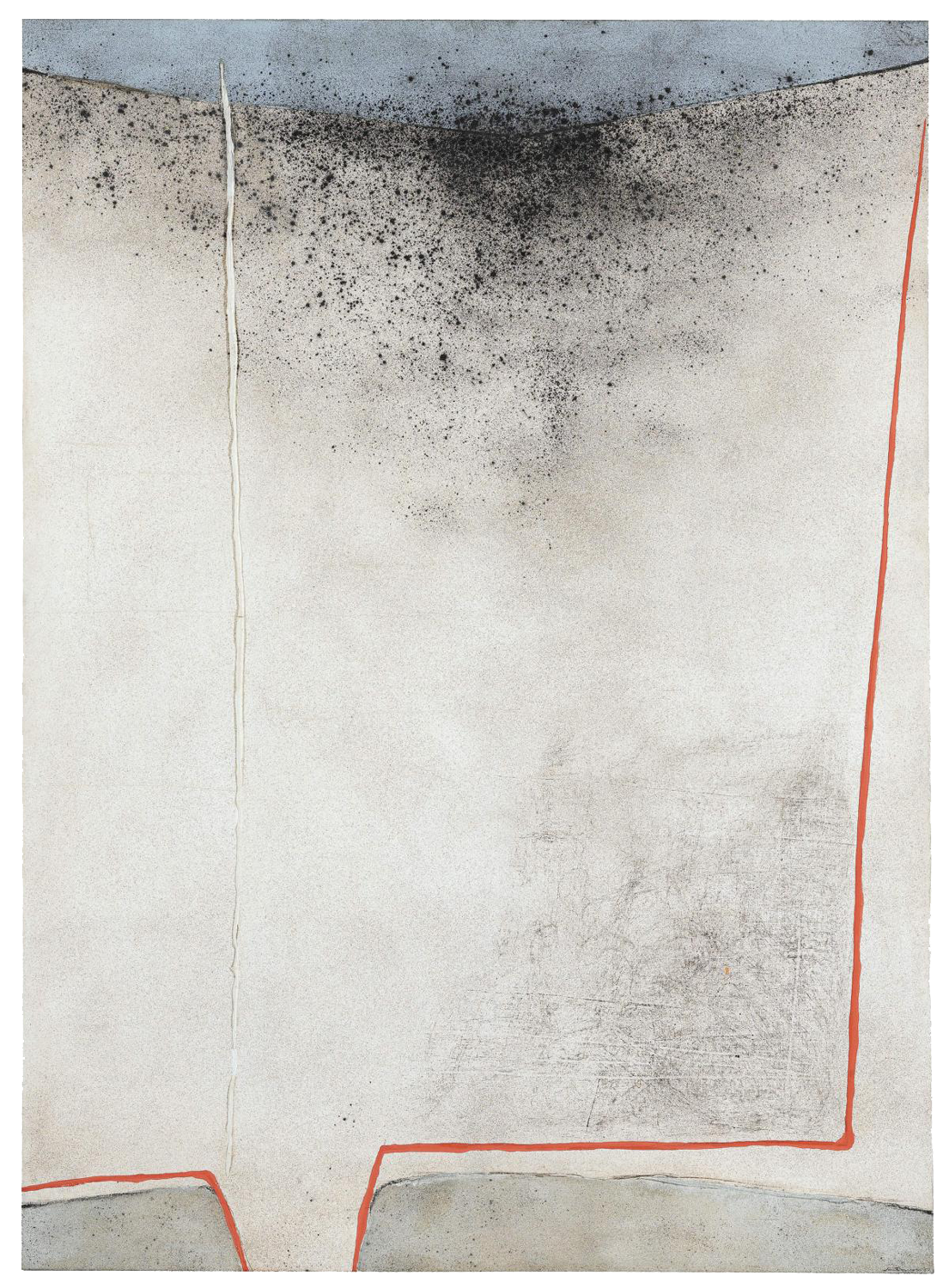
Giuseppe Santomaso often refers to older Italian painting in his own work indicating a rich understanding of the artistic tradition to which he belongs. The reference to Cimabue’s crucifix in the title of the work can be found in the colours used. Cimabue created a depiction of the cross which was unusual for the Middle Ages, one which stands out from others from this period in terms of form and colour. Blue and red play a special role in his work which Santomaso takes up and integrates into his 1967 work.
On the white canvas, a red line gives the composition structure and leads the viewer’s gaze. It provides an outline to two grey elements pushing onto the surface at the lower edge of the painting and directs your attention to the black splashes of paint in the upper part. The image is then completed by a blue block of colour.
Giuseppe Santomaso (1907–1990)
Ommagio al Crucifisso di Cimabue, 1967
Currently exhibited: No
Material: Oil and mixed media on canvas
Size: 162 x 118 cm
Inv-Nr.: B_393
Image rights: VG Bild-Kunst, Bonn
Keywords:
Previous owner: Private collection, Amsterdam; Galleria Blu, Milan; Alexander Orlow for Sammlung Peter Stuyvesant, Amsterdam, 1967; Sotheby’s, Amsterdam, 2010; private collection, Europe; Sotheby’s, London, 2012
Acquisition: Reinhard Ernst Collection, Sotheby’s, London, 2017
Solo exhibition:
2001
‘Santomaso’, Milano Galleria Blu, Milan, Italy
Group exhibitions:
1968
‘Het Museum in de Fabriek, Peter Stuyvesant Collectie’, Stichting Cultureel Centrum in Dominicanenkerk, Maastricht, Netherlands
1967
‘The Ninth Japan International Art Exhibition’, Metropolitan Art Museum, Tokyo, Japan
What does this work from the Reinhard Ernst Collection have to do with the Florentine artist Cimabue, who was active in the 13th century and to whom the title of the work (Homage to the Crucifix of Cimabue) refers?
It provides an outline to two grey elements pushing onto the surface at the lower edge of the painting and directs your attention to the black splashes of paint in the upper part. The image is then completed by a blue block of colour. The reference to Cimabue’s crucifix in the title of the work can be found in the colours used. Cimabue created a depiction of the cross which was unusual for the Middle Ages, one which stands out from others from this period in terms of form and colour. Blue and red play a special role in his work which Santomaso takes up and integrates into his 1967 work. Santomaso often refers to older Italian painting in his own work indicating a rich understanding of the artistic tradition to which he belongs.
This homage to one of the most relevant protagonists of the past clearly illustrates the artistic-political position he adopted in the Italian art scene from the 1950s on. Santomaso developed into one of the most important Italian artists of the post-war Italian scene as evidenced by the fact that the Venetian artist took part in Venuice Biennale no less than thirteen times. He visited and studied in Amsterdam and Paris and held his first solo exhibition at the Galerie Rive Gauche in Paris in 1939. He co-founded Nuova Secessione Artistica Italiana artists group (New Italian Art Secession) in 1943 – the group would go on to change its name to Fronte Nuovo delle Arti (New Front of the Arts). Over time, different artistic tendencies emerged in the group which eventually led to the representatives of abstract painting forming the Gruppo degli Otto (the Group of Eight) in 1952. Santomaso was joined in the group by Emilio Vedova and Renato Birolli, both of whom have work included in the Reinhard Ernst Collection. Santomaso’s works were included in numerous international exhibitions, including the São Paulo Biennale in 1951, 1953, and 1961, and the documenta in Kassel in 1955, 1959, and 1964. From 1956 to 1974, the Venetian artist also held a professorship at the Accademia di Belle Arti in his hometown.